With every webpage loaded, email sent, or video streamed, network traffic takes a complex journey…
We’ve introduced new features and integrations with Office 365 Service Health messages and notifications. You can subscribe to filtered emails and webhook integration. Read more about them.
We’re huge fans of the Office 365 Service Health Dashboard and, more importantly because we integrate with it, the Service Health Communications API. Its arguably the best dashboard there is for a cloud service and provides the most comprehensive per-tenant view of its kind.
But we’ve heard some people describe the Office 365 Service Health Dashboard as Monitoring and that’s not what it is. Its just observing what Microsoft deems is post-worthy as an incident or advisory. And its really just from their end — the perspective of Microsoft’s vast data centers. The Service Health Dashboard doesn’t tell you about problems on your side and its not monitoring what’s happening end-to-end. Read on for more clarity.
What’s New In The Office 365 Service Health Dashboard
The Service Health Dashboard was recently upgraded with improvements to the information that it provides and “made more actionable”, so they say. You can read about it here: https://blogs.office.com/2017/03/01/whats-new-in-office-365-administration-new-service-health-dashboard-now-generally-available/
Here’s an example of the latest and greatest:
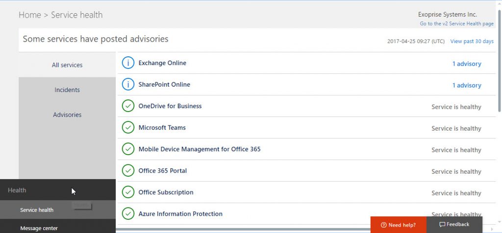
From this view you can see one of the key improvements in that it now separates incidents from advisories. This should help administrators focus on issues and outages that need more attention vs advisory notes about obscure features that may be operating in a degraded fashion. At least that’s been our experience with the new posts and what it publishes so far.
Another excellent feature relates to the impact on your organization. From the dashboard you can see the percentage of users in your tenancy that are likely to be impacted from the advisory or incident. Unfortunately, this only applies to Exchange Online for now with the intent to enable this feature for other services over time.
And the last new feature that’s mentioned is the ability to accept more detailed feedback. You used to be able to rate an incident with stars (1 to 5) but now you can provide richer feedback to Microsoft.
Why the Service Health Dashboard Isn’t Enough — It’s Not Monitoring
When you sign in to the Office 365 Admin Portal and examine the Service Health you are just seeing the incidents and advisories that Microsoft is aware of at the time and that they’ve been able to publish. The single biggest thing missing from the Service Health Dashboard is that it doesn’t tell you anything about what’s going on FROM YOUR SIDE. That’s pretty important.
If you have end-users spread throughout multiple offices or the world you won’t have any idea about how their access or experience with Office 365 is doing. Your tenancy in Office 365 may be great but you might have a problem elsewhere in the network or what we call the Service Delivery Chain.
There are other mysteries with the information provided by the Service Health Dashboard:
- Microsoft hasn’t provided any information about how advisories and incidents make it into the Service Health Dashboard— we can take some guesses about it but we don’t really know the escalation process. This doesn’t just affect Microsoft’s dashboard, other cloud service dashboards are a mystery too.
- Microsoft has automated testing in place for their services — but we hardly know anything about their coverage or how it works. We DO know that it’s not end-to-end for every customer and tenant.
- Microsoft probably has comprehensive logging and error detection for their backend services — but that just covers their datacenter operations and doesn’t cover the end-to-end experience. Additionally, Office 365 is HUGE and growing every day so we don’t know what the coverage is across the applications.
- They don’t tell you when you aren’t affected— and this is just as important as telling you that you MAY be affected. The latest impact percentages are an awesome step in providing more information about the health of your tenancy. But as we mentioned they only currently cover Exchange Online and they don’t tell you anything about your network, LAN, WAN, Single Sign-On Providers or any of the other pieces that your cloud deployment depends on.
Integrated Office 365 Service Health Dashboard with End-To-End Monitoring
Here’s the part you knew we were going to get to – the pitch. With CloudReady you get an integrated end-to-end view of your network, your LAN, your WAN, your branch offices and your Single Sign-On solutions alongside the same information as the Office 365 Service Health Dashboard. And you can get this even with just deploying a single CloudReady sensor for monitoring a single application like SharePoint or Exchange Online. Here’s an example screenshot:
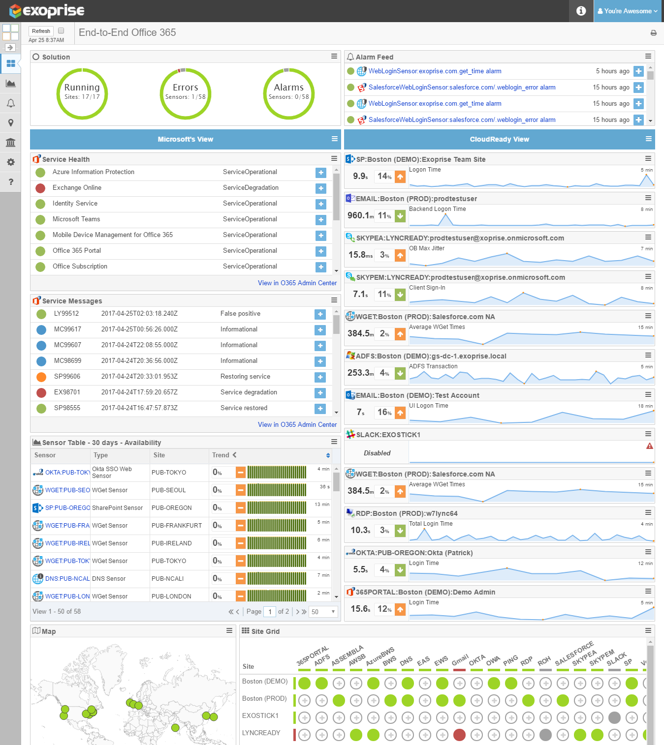
Allow me to point out a few items:
Here’s why we call it a 360 view of your cloud applications:
- On the left-hand side you have two widgets for the Service Health. One is for the current status and the other is a feed for the service health messages for your tenancy. You configure this by allowing OAuth access one time for our application to read the health messages for your tenancy. We call this side the Microsoft View.
- On the right-side is a number of widgets that represent the health of the different services you may be monitoring with CloudReady. We call this the CloudReady view. These are the real tests that our sensors are performing against services (in the order of the screenshot) like Exchange Online, SharePoint Online, Skype for Business Online and more. You can also sensors for Salesforce, Remote Desktop, ADFS, Okta, Slack and more.
- This is a 360° view of your Microsoft Office 365 cloud deployment and other SaaS services that your organization has adopted.
We’re always adding new sensors, new widgets and capabilities in CloudReady. You can improve your coverage today with a single sensor deployment and get this integrated view of the Service Health Dashboard and your perspective.
Related Posts