With every webpage loaded, email sent, or video streamed, network traffic takes a complex journey…
This is the third part in a four part series on the CloudReady dashboards and visualizations. The first part covered basics like Overviews, Refresh, and Layout settings. The second part covered more advanced dashboard usage like layout pinning, capture and embedding. In this third part we’ll cover key widgets, their usage and settings.
Widget Types
Widgets are the sub-windows or tiles that can be moved and resized within a layout or tab in the CloudReady dashboards. Most widgets are configurable and there are many different widgets available for visualizing cloud performance data in real-time and historically.
Widgets are available, sensibly, via the Widget Dropdown in the top toolbar. We’ve tried to organize the widgets according to their purpose:
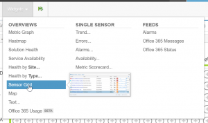
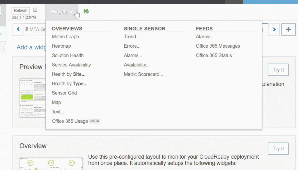
Widget Dropdown – Hover to See a Preview, Click to Add a Widget Overviews
Overview widgets are for visualizing data across multiple sensors and sites like the heatmap or grid- Single Sensor
Single sensor widgets are for focusing on the performance of a single web application or cloud service - Feeds
Feed widgets are scrolling lists of information like the alarm feed
Adding Widgets
When you drop down the widget menu from the toolbar, you will see previews as you hover over the different widgets to add. The previews help you remember what the widget looks like.
Click on the name of the widget to add it to your current layout. Adding a widget adds it to the bottom of the current layout. You may have to scroll to the bottom to see the newly added widget. If a widget requires information before it can be added to a layout, for example a particular site or sensor, then you will be prompted to enter or select the information.
Resizing
Most widgets can be resized to fit alongside other widgets within a layout, grab any of the edges to reposition and resize the widget to fit along side other tiles and build your dashboard.
Cloning a Widget
Widgets on a layout can be easily cloned for adjusting and copying. This can be helpful if you have a long layout and are scrolled to the bottom or middle and want to add one in place, or edit and adjust a widget to include data about a different sensor.
Resource and Access Control for Widgets
For widgets that contain multiple sensors, a user only gets to see the sensors that they have access to see and, in turn, they only see sites that have sensors that can be seen. This can be very helpful when creating and leveraging teams and roles.
For example, let’s say you have an Exoprise Team defined just for SharePoint monitoring and only in a few sites. If you create a team with just those sensors, when those users create a Heatmap (see below), they will only see sensors and sites they have permission for. This helps build dashboards rapidly – even automatically with the default dashboard that is created for every user.
Heatmap
The Heatmap widget is a core widget that is added automatically to the default dashboard when you start deploying. There are additional configuration options available that help narrow and focus the heatmap for specific monitoring and for getting a an overview historically of the reliability of your cloud apps.
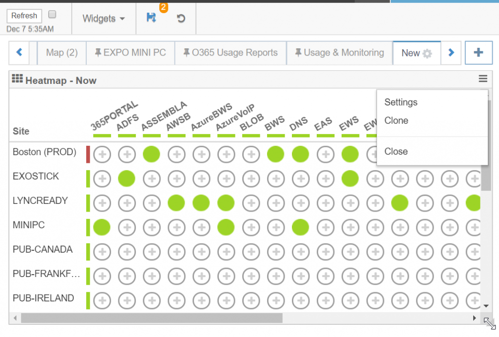
To change the Heatmap configuration, click the settings from the Widget menu in the upper right of the Heatmap tile. All widgets have menu items for cloning and closing.
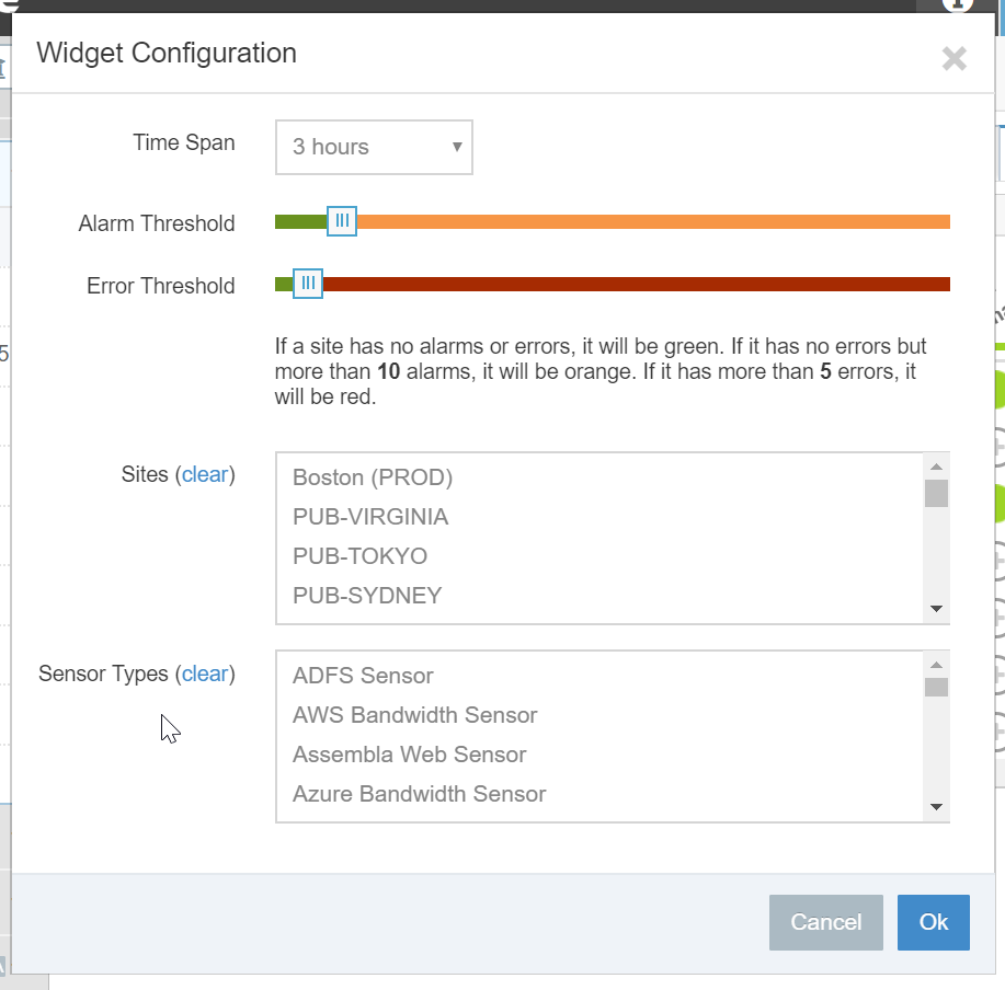
Heatmap Configuration
To the right is a Heatmap settings dialog (click to enlarge). By default, a Heatmap displays the most recent data collected for each sensor and site (Now) and whether there are errors (red) or alarms (orange). But you can configure a Heatmap to display health statistics over the different time periods. When you change the time period, you can select the thresholds that will change the indicator for the sensors within the Heatmap.
You can also limit the Heatmap to specific sensors and sites which is helpful if you are building dashboards for different teams and high-level views of different services.
Interactions
The Heatmap is interactive as well, using the mouse, you can perform the following:
Heatmap Right Click Popup Left-click on a disc and it can drill through into a grid of sensors that show you the trend, errors, or alarms depending on the cumulative state of the sensors for that row and column.
- Right click on a disc will popup a tool-tip that shows you the last updated or disabled sensors that the disc represents
- Left-click on a site name in the left-hand column and you will see a grid of all of the sensors running on that site (brilliant!)
- Left-click on a column heading (sensor type) and you will see a grid of all of the sensors of the same type across your tenancy (brilliant)!
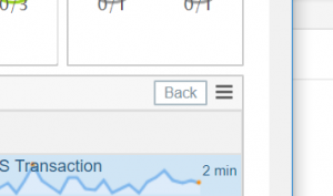
Whenever you use one of the methods to drill down through a heatmap you can go back to the heatmap overview via a small ‘Back’ button in the titlebar area of the widget.
Map Widget
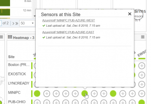
The CloudReady Map widget is perfect for visualizing the health of all of the SaaS services that are being monitored from the different sites and branch offices that you’ve deployed to. Map widgets are added automatically to the default dashboard when you start deploying. CloudReady automatically determines the geographic location of a site but you can also enter the address for a site if you want the site to be located differently on the map.
Map Configuration
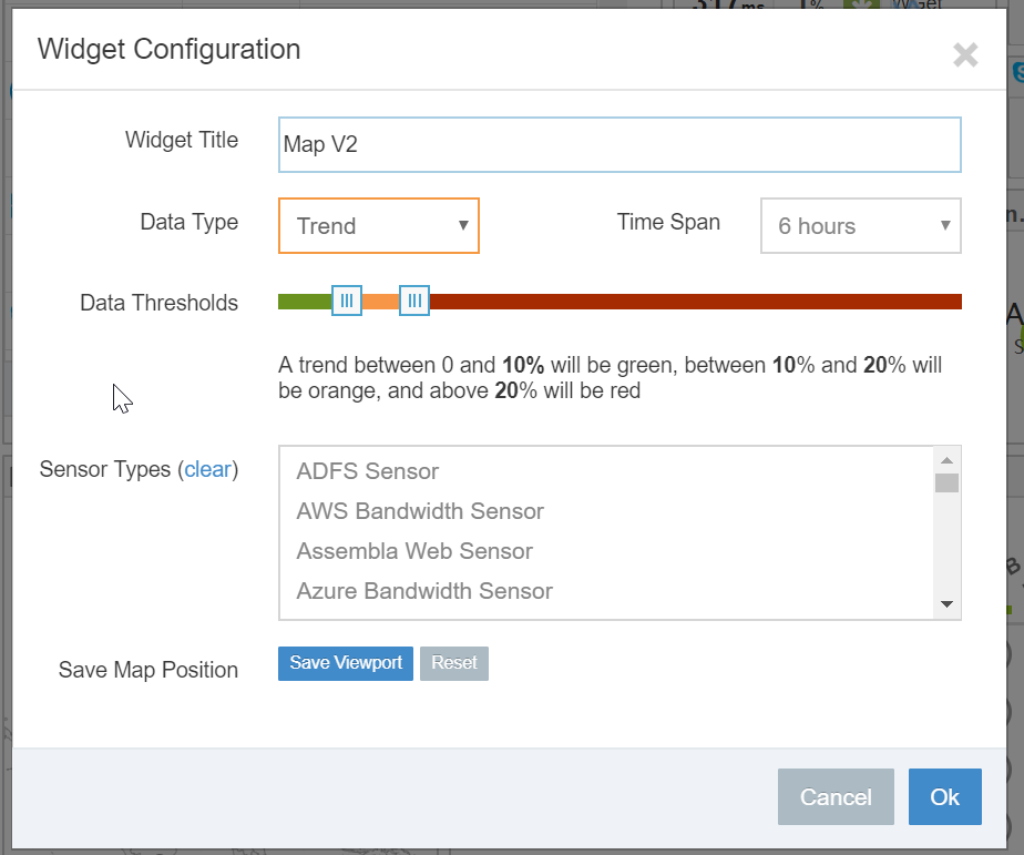
Options for configuring the map widget are similar to the heatmap. You can filter by sensor types and if you configure the time period, you can highlight and change the color of sites depending on their trending or event counts (errors and alarms). Click to enlarge the example to the right.
You can also configure a viewport into the map widget. This is helpful for zooming in on a particular area and saving the view. To use this feature just zoom in the map, double-click or use the ‘+’ button. And then go to settings and click ‘Save Viewport’.
Interactions
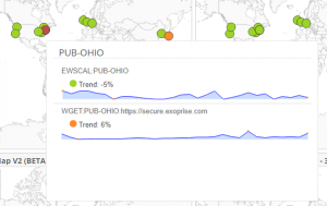
We recently introduced new popups within the Map widget to get more immediate visibility into the health of the sensors running on a particular site. Hover over a site to see of the sensors running on that site, their errors and trends and from that popup, you can click through to any of the sensors.
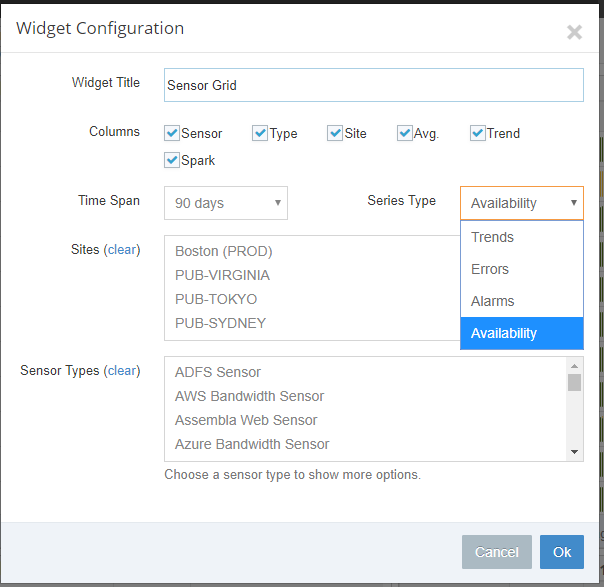
Sensor Grid
The Sensor Grid widget is the last component we’ll cover for this article. The Sensor Grid (aka a table) lots of special powers and flexibility so we’ll cover a few aspects. The sensor grid can display any number of sensors and spark-lines for trending, alarms, errors, and availability. It also makes use of special caching to speed it up for large numbers of sensors especially if you use the refresh button for the dashboard.
Grid Configuration
The grid configuration has numerous options and also includes the ability to display less columns when the girds are displayed in a mobile device (responsive). You can:
- Control which columns are displayed by default. Depending on your filters for the grid, you may not need to see every column.
- Control whether you are viewing Trending, Errors, Alarms or Availability in the spark-line for the grid.
- If you are viewing trends and select specific sensor types, you can select any particular element to focus on for trending
- Filter by Sites and Sensor Types
- Configure the Time Span for the grid
That’s it for this third installment in the dashboard and visualization series. The fourth and final article in this dashboard and visualization series covers additional widgets including alarm feeds, scorecards and metric graph charting.
Related Posts