With every webpage loaded, email sent, or video streamed, network traffic takes a complex journey…
This is the fourth and final article of a series on the CloudReady dashboards and visualizations. With a better understanding of the various widgets available, you can build custom dashboards that cover the end user experience for any application delivered to a branch office or location.
The first part covered basics like Overviews, Refresh, and Layout settings. The second part covered more advanced dashboard usage like layout pinning, capture and embedding. The third article covered key widgets used within the dashboards. In this part we’ll finish up with other important widgets such as:
- Alarm Feed
- Overview widgets (circles)
- Scorecard
- Metric widget
Alarm Feed Widget
The alarm feed widget displays the latest alarms generated by CloudReady in reverse chronological order. The feed will display up to 3 days of alarms or the most recent 50, whichever is greater.
Each alarm in the feed will be have a red indicator if its in an alarm state and green if the alarm or condition has already resolved itself.
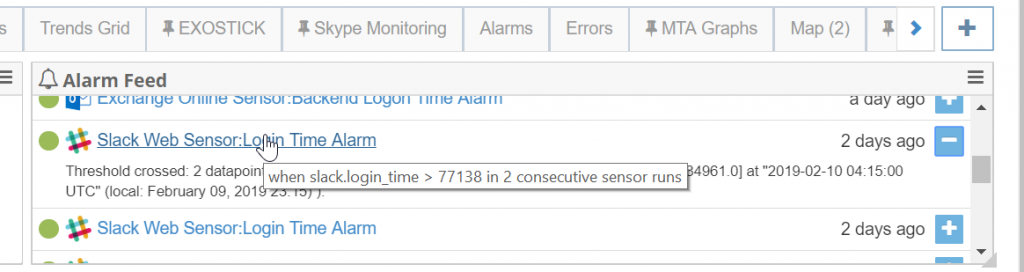
This enables a quick glance to see how the past few days have been going. Its a good place to start if you’re interested in tuning alarms or adjusting monitored conditions.
Interactions
There a few different interactions with the Alarm feed. You can expand an alarm record by clicking the plus sign. If you click on the Alarm title you are taken to its page where you can see a history of how frequently the alarm has fired and edit the alarm or tune it from that page.
If you click on the icon for the sensor type, you will be taken to the canonical detail page for that sensor and are able to examine the sensor with more details.
Overview Widgets
There are a number of different overview widgets for including in the dashboard:
- Solution Overview
- Site Overview
- Sensor Type Overview
The overview widgets provide a quick glance into the overall health of the entire deployment, a particular sites, or for examining an overview of different types of sensors that may be deployed across regions. If you’re building a branch office or site specific layout, choose a Site Overview to quickly see the health or end user experience of all of the apps being monitored from that branch.
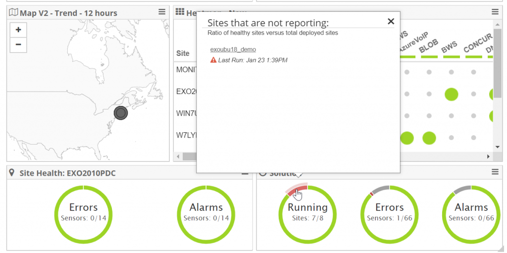
Site and Sensor Type Overviews
Site and sensor type overviews can be added from the drop-down widget menu. Choose the widget type that you would like and you will be prompted to select the site or type of sensor.
Scorecard Widget
The scorecard widget displays a single metric with a color-coded tile for placing in a dashboard. The metric can be a single element from a senor OR an element aggregate across sensors of the same type. This can be useful for quickly determining the health of a particular cloud service like Office 365, Exchange mail flow or SharePoint and Skype.
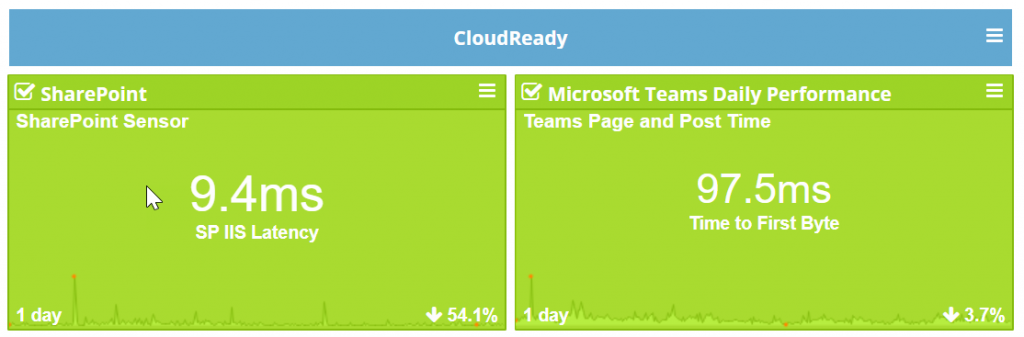
The tile or widget changes color based on the trend over the selected period. If the trend is up >10% over the period its red, if the trend is up 0-10% its orange, trending down or improving then its green. All of our trends are measured as the last 20% of samples vs the first 80% (left to right).
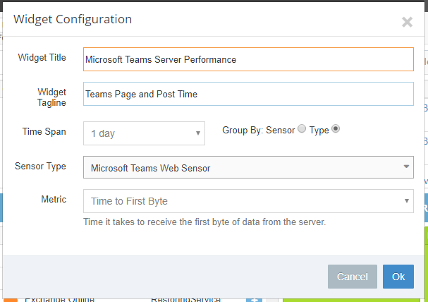
Scorecard Configuration
There are a number of options for configuring the scorecard widget and getting it to display almost anything about the health of your network and SaaS apps.
In the view to the right, you can see a scorecard configuration for examining the performance of the Microsoft Teams server, its Time-to-first-byte (TTFB) metric grouped and aggregated across all of the Teams sensors that you’ve deployed. You can configure a number of options:
- Title and Tagline – annotate the scorecard with titles and information that describe the metric in your own words.
- Time Span – you can select data aggregates for as little as 3 hours or as much as 90 days to see long term trending
- Group By – to see a specific element for a sensor select the scorecard to group by sensor. To see an aggregate across all sensors of the same type, select group by type.
- Metric – choose the metric to display. You can even see the underlying Network Path Performance to a particular service aggregated across all of the types.
Click OK to save the configuration.
Metric Graph
One of our most requested new widgets is the Metric Graph which enables combining elements from any number of disparate sensors across our product line into a single chart. This widget is ideal for correlating different metrics and performance information from different sensors. For example, correlating metrics from Single Sign-on providers like Okta or Azure AD with underlying SaaS sensors such as SharePoint or Salesforce to see how SSO performance might be affecting access to a cloud application.
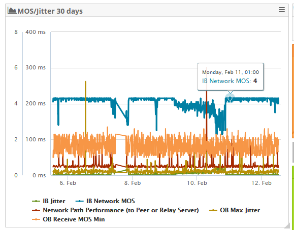
In this example, we have a configuration that is focused on Skype for Business monitoring. To the right is a Metric Chart that covers Skype MOS / Jitter metrics over a 30 day period. Different individual metrics are pulled from deployed Skype sensors that enable you to immediately correlate the affects of Jitter and Skype Mean Opinion Scores which is a measure of call quality from a branch office.
Metric Graph Configuration
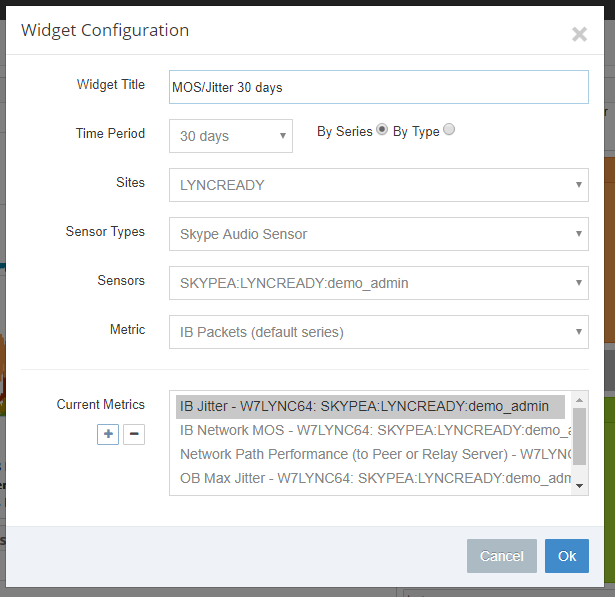
To add a metric graph to your dashboard layout, choose the Metric Graph from the Widget selection at the top of page and it will open a dialog for configuration similar to what is displayed to the right. You can group by sensor or aggregate by type to display metrics across different sensor deployments.
In this example, four elements are selected from a particular Skype sensor deployment to examine and correlate Jitter and MOS metrics over a 30 day period. Grouping and displaying these metrics are great for building a Skype specific dashboard for a particular region or branch office.
That’s it for this fourth and final installment in the dashboard and visualization series. We are always introducing capabillities and widgets for enhancing the display of SaaS and network metrics within CloudReady. If there’s something you don’t see or have questions about any of them, just send us a note to [email protected].
Related Posts